Cost Explorer
The Cost Explorer is the analytics workspace for your WiLine Edge Cloud (WEC) spending. Where the Billing Overview shows how much you owe, the Cost Explorer shows where your money goes and why — breaking the bill down by category, offering, and day.
Use it to:
- See compute, storage, and IP costs at a glance
- Track daily trends and drill into the resources behind any day
- Compare offerings and export records for reporting and budgeting
The dollar amounts, dates, and offering names on this page are illustrative examples from a sample account — they are not quoted prices. For current published rates by offering, see the WiLine Edge Cloud pricing page.
Access the Cost Explorer
After logging in to the WiLine Edge Cloud:
- Navigate to Management → Billing → Cost Explorer
When the page opens you will see a dashboard built from four stacked sections, each going one level deeper than the last:
- Cost Summary — totals by category for the current period
- Daily Cost Analysis — a daily spending chart with headline insights
- Daily Breakdown — a row-per-day table you can drill into and export
- Cost per Usage — cost distribution across every offering you ran
All figures reflect the current billing period unless you change the view.
Cost Summary
The summary at the top of the page splits your current spend into its main categories, so you can immediately see what is driving the bill.
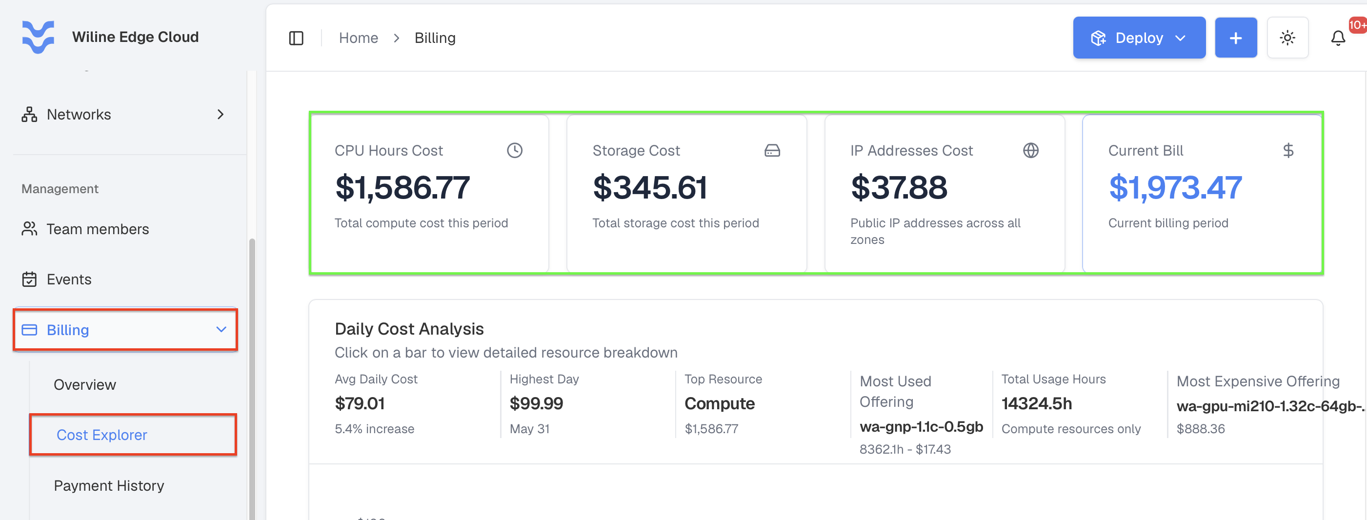 Figure 1: Cost summary showing current usage and billing totals by category.
| Card | What it shows | Example |
|---|---|---|
| CPU Hours Cost | Total compute cost this period | $1,586.77 |
| Storage Cost | Total storage cost this period | $345.61 |
| IP Addresses Cost | Public IP addresses across all zones | $37.88 |
| Current Bill | Running total for the current billing period | $1,973.47 |
The first three cards are the components of your spend; the Current Bill card is their sum for the period. In this example, compute ($1,586.77) accounts for the large majority of the $1,973.47 bill — a strong signal that any optimization effort should start with compute.
Use this summary to quickly identify which resource category to investigate in the sections below.
Daily Cost Analysis
This section plots your daily spending over time as a bar chart, with a set of headline insight cards beside it.
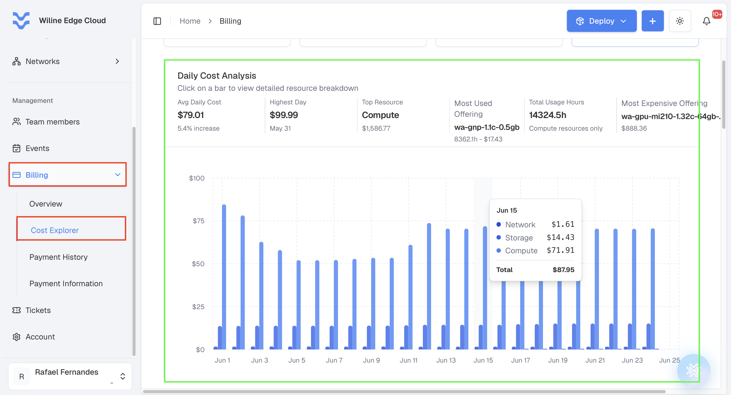 Figure 2: Daily cost analysis chart with per-day spending and headline insights.
With the chart you can:
- Read the shape of your spend across the period — flat, climbing, or spiky
- Hover over a bar to see that day's total
- Click a bar to drill into a resource-level breakdown for that specific day
- Spot spikes that warrant investigation
Click any bar to drill down into the detailed resource usage that produced that day's cost.
Key Insights
The insight cards summarize the period at a glance:
| Insight | Meaning | Example |
|---|---|---|
| Avg Daily Cost | Average spend per day, with the trend vs. the previous period | $79.01 (▲ 5.4%) |
| Highest Day | Most expensive single day | $99.99 on May 31 |
| Top Resource | Resource category with the highest cost | Compute — $1,586.77 |
| Most Used Offering | Offering with the most usage hours | wa-gnp-1.1c-0.5gb — 8362.1h, $17.43 |
| Total Usage Hours | Total compute usage time for the period | 14324.5h (compute only) |
| Most Expensive Offering | Single offering with the highest cost | wa-gpu-mi210-1.32c-64gb-vram (GPU) — $888.36 |
These metrics work together: the Most Used Offering is often a small, cheap instance running constantly, while the Most Expensive Offering is usually a high-end GPU running far fewer hours. In the example, a $17.43 general-purpose instance is the most used, but a single $888.36 GPU offering is the most expensive — more than half of all compute cost.
Chart Settings
On the top-right of this section, click the Chart View icon to change what the chart emphasizes. Each view re-frames the same data from a different angle:
- Resource Breakdown — cost split by resource type (compute, storage, IPs)
- Usage Trends — how cost moves over time
- Offerings — cost grouped by instance offering
Daily Breakdown
Below the chart, the Daily Breakdown table lists one row per day, giving you the same data in a precise, sortable form.
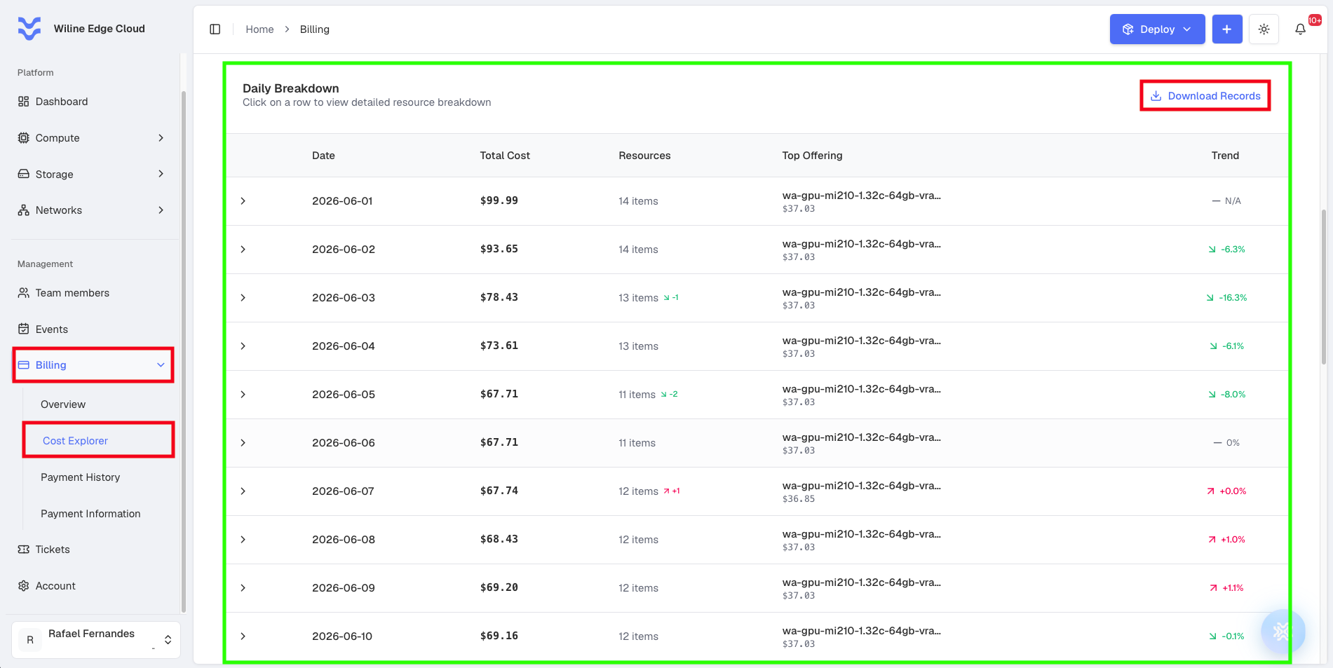 Figure 3: Daily breakdown table with per-day costs, resource counts, and exportable records.
Each row includes:
- Date — the calendar day
- Total Cost — total spend for that day
- Resources — number of billable resources active that day; a
+1/-2badge shows the change from the previous day - Top Offering — the offering that cost the most that day, with its amount
- Trend — percentage change in total cost vs. the previous day
A representative stretch of the table looks like this:
| Date | Total Cost | Resources | Top Offering | Trend |
|---|---|---|---|---|
| 2026-06-01 | $99.99 | 14 items | wa-gpu-mi210-1.32c-64gb-vram — $37.03 | N/A |
| 2026-06-02 | $93.65 | 14 items | wa-gpu-mi210-1.32c-64gb-vram — $37.03 | -6.3% |
| 2026-06-03 | $78.43 | 13 items (-1) | wa-gpu-mi210-1.32c-64gb-vram — $37.03 | -16.3% |
| 2026-06-05 | $67.71 | 11 items (-2) | wa-gpu-mi210-1.32c-64gb-vram — $37.03 | -8.0% |
| 2026-06-11 | $76.84 | 13 items (+1) | wa-gpu-mi210-1.32c-64gb-vram — $36.85 | +11.1% |
| 2026-06-12 | $89.79 | 13 items | wa-gpu-mi210-1.32c-64gb-vram — $37.03 | +16.9% |
Reading the Resources and Trend columns together explains why a day moved: the -16.3% drop on June 3 lines up with one resource being removed (-1), and the +11.1% rise on June 11 lines up with one being added (+1).
Drill into a day
Click any row to expand the full resource-level breakdown for that day. This reveals every individual service that contributed to the day's total, so you can see exactly what ran and what each item cost.
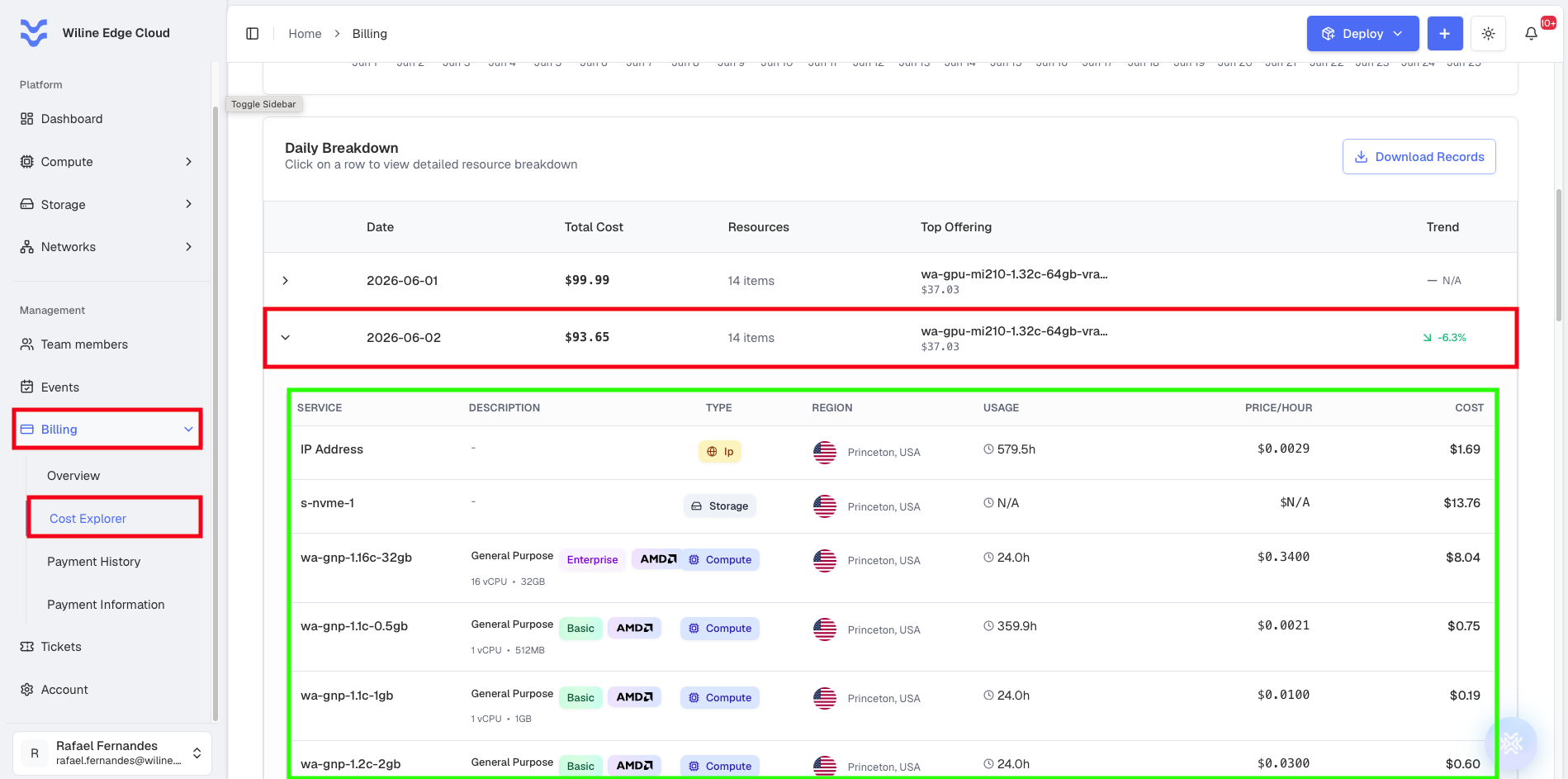 Figure 4: Resource-level breakdown shown after clicking a day in the Daily Breakdown table.
Each line in the breakdown shows:
- Service — the offering or resource name (for example,
wa-gpu-mi210-1.32c-64gb-vram) - Description — the instance class, tier, and specs (for example, General Purpose · Basic · AMD · 1 vCPU · 512MB)
- Type —
Compute,Storage, orIp - Region — where the resource ran (for example, Princeton, USA)
- Usage — hours billed in the period (storage shows
N/A) - Price/Hour — the hourly rate for that resource
- Cost — the resource's contribution to the day's total
For example, expanding June 2 ($93.65) shows lines such as:
| Service | Description | Type | Region | Usage | Price/Hour | Cost |
|---|---|---|---|---|---|---|
wa-gpu-mi210-1.32c-64gb-vram | AI Optimized · 32 vCPU · 64GB | Compute | Princeton, USA | 24.0h | $1.5400 | $37.03 |
wa-gpu-a6000b-1.8c-32gb-24vram | AI Optimized · 8 vCPU · 32GB | Compute | Princeton, USA | 17.7h | $0.8200 | $14.42 |
s-nvme-1 | — | Storage | Princeton, USA | N/A | N/A | $13.76 |
wa-gnp-1.16c-32gb | General Purpose · Enterprise · AMD · 16 vCPU · 32GB | Compute | Princeton, USA | 24.0h | $0.3400 | $8.04 |
IP Address | — | Ip | Princeton, USA | 579.5h | $0.0029 | $1.69 |
wa-gnp-1.1c-0.5gb | General Purpose · Basic · AMD · 1 vCPU · 512MB | Compute | Princeton, USA | 359.9h | $0.0021 | $0.75 |
This view ties the summary back to reality: the GPU offering at $37.03 is the day's Top Offering from the table above, and the long-running wa-gnp-1.1c-0.5gb instance (359.9h) shows how a low hourly rate can still accumulate meaningful usage.
Download Records
To export the data for reporting or auditing:
- Click Download Records
- The platform generates a detailed report (PDF) of the breakdown
Exported records are useful for:
- Internal cost reporting and chargeback
- Auditing and reconciliation against invoices
- Sharing cost data with finance or stakeholders
Cost per Usage
The final section shows how cost is distributed across every offering you ran, making it easy to compare resources side by side and find optimization targets.
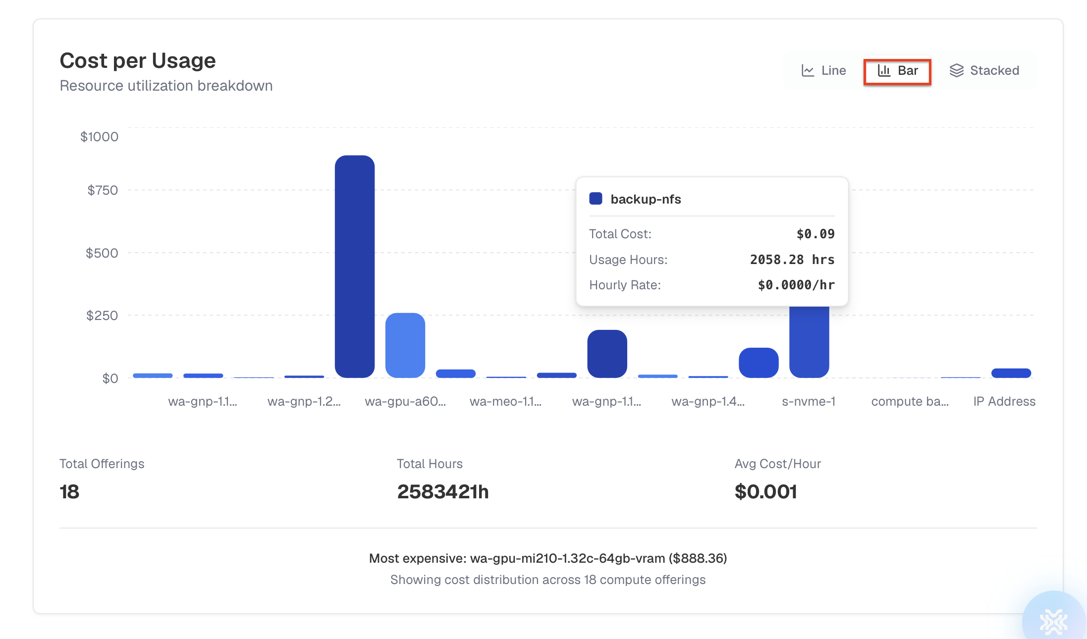 Figure 5: Cost distribution by usage across resources and offerings.
Chart Types
Switch between three visualizations depending on what you want to see:
- Line — how each offering's cost trends over time
- Bar — direct comparison of offerings against each other
- Stacked — cumulative distribution of total cost
Insights
| Insight | Meaning | Example |
|---|---|---|
| Total Offerings | Distinct offerings billed this period | 18 |
| Total Hours | Combined usage hours across all offerings | 2,583,421h |
| Avg Cost/Hour | Average cost efficiency across offerings | $0.001 |
| Most Expensive Offering | Highest-cost offering this period | wa-gpu-mi210-1.32c-64gb-vram — $888.36 |
In this example the explorer is "showing cost distribution across 18 compute offerings," and the GPU offering wa-gpu-mi210-1.32c-64gb-vram stands out at $888.36 — confirming what the Daily Cost Analysis already hinted at.
Use this section to:
- Compare offerings and rank them by cost
- Identify high-cost or under-utilized resources
- Decide where to resize, consolidate, or shut down resources
A typical workflow
The four sections are designed to be read top to bottom, narrowing from "what" to "why":
- Cost Summary — see which category dominates the bill (here, compute).
- Daily Cost Analysis — find the most expensive days and the offerings behind them.
- Daily Breakdown — confirm what changed on a given day and export the records.
- Cost per Usage — pinpoint the specific offering to optimize.
Key Benefits
The Cost Explorer allows you to:
- Gain deep visibility into your cost drivers by category, day, and offering
- Detect spending anomalies and tie them to resource changes
- Optimize resource usage and costs with offering-level comparisons
- Export reports for financial tracking and auditing
Next Steps
- Review daily cost trends regularly to catch increases early
- Investigate your Most Expensive Offering for resizing or consolidation opportunities
- Export records each billing period for budgeting and reconciliation
- Revisit the Billing Overview for balance and payment status, or Payment History for invoices and receipts